
Microinteractions: Little Details, Big Difference
Ever since I read Dan Saffer’s Microinteractions, I developed a big interest in the little details.
From the book — Microinteractions are contained product moments that revolve around a single use case. For example — setting an alarm, logging into your favorite website, etc.
Everyday, we interact with a lot of apps and websites — some of those interactions are good and some bad. Some of the ones that caught my attention are
Microinteraction #1 — Close Multiple Tabs in Safari (iOS)
I discovered this gem only recently — long pressing the tabs icon on Safari in iOS reveals a menu with an option (among others) to close all the open tabs.
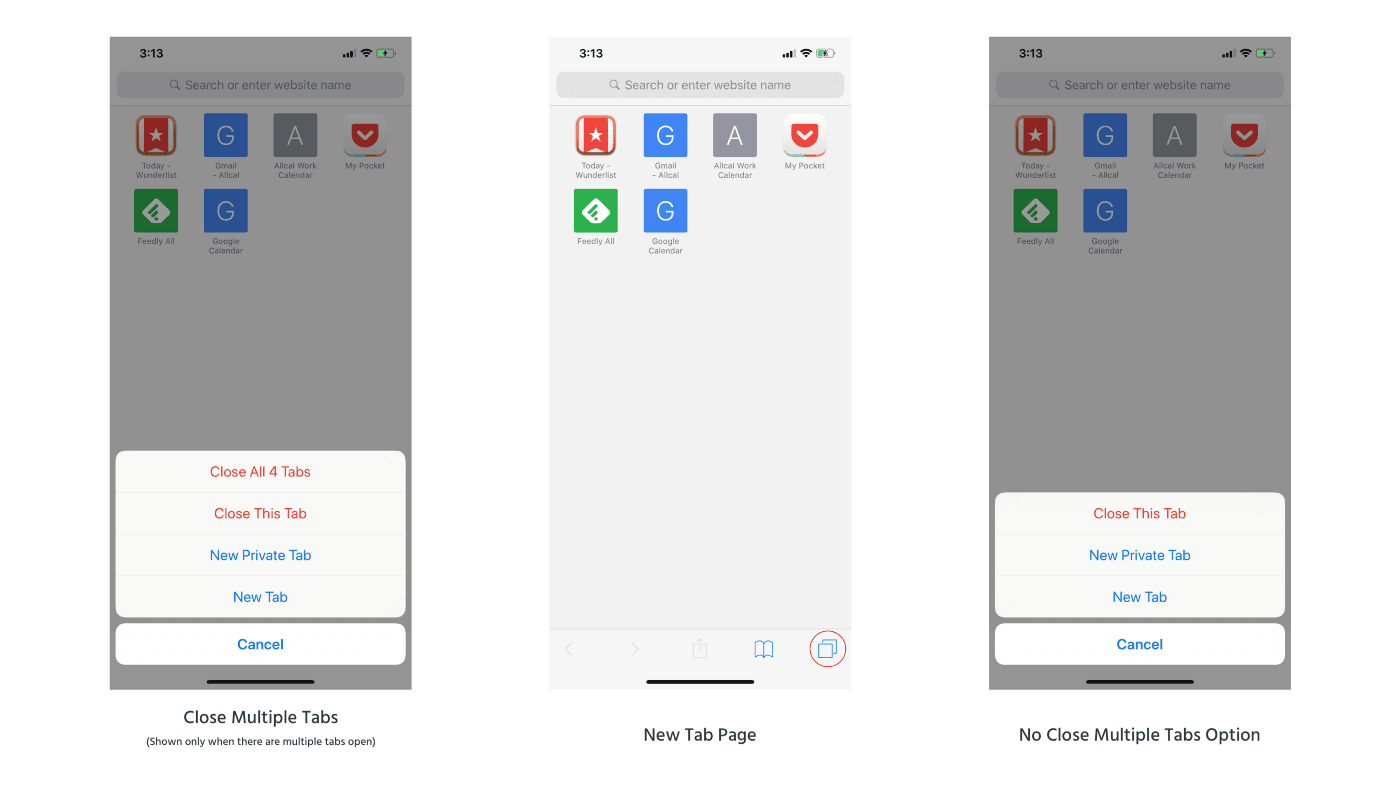
Close Multiple Tabs in Safari
Trigger
The trigger is the tabs icon which is located on the bottom right corner on the iPhone & on the top-right corner on the iPad. A single tap reveals a scrollable list of open tabs in the main part of the screen. However, when you press and hold the tabs icon, it reveals a menu with an option (among others) that reads “Close All x Tabs” where x is the number of tabs open. Since it is a close action, the text is in red.
Usually, actions need affordance but we do not have a visible one here. Closing All Tabs is not a common action on the page and is likely a power-user feature. Hiding the option underneath the related tab icon isn’t a problem. Showing the text in red is also a nice touch to highlight the dangers of losing the open tabs.
Rules
“Close All x Tabs” option shows up only when there are more than one tabs open. Otherwise, there are just three options in the menu.
The menu option is shown conditionally, thus avoiding confusion with the “Close this tab” when there is only on open tab.
Feedback
When the “Close All x Tabs” is chosen, all the open tabs are closed. On the iPad, the tab bar — which contains the list of open tabs disappears revealing just an empty tab. However, on the iPhone, the only thing you see is the current tab being closed and it opens an empty tab.
A message indicating that all tabs have been closed would be a nice addition.
Loops & Modes
In the “Close All x Tabs” option, “x” is the number of the tabs open.
Showing the number of open tabs is very intuitive. This could be a quick way of knowing how many tabs you have open. The concept of “Bring the data forward” is put to good use here.
Microinteraction #2 — Double Press Power Button to Open Camera on Essential Phone
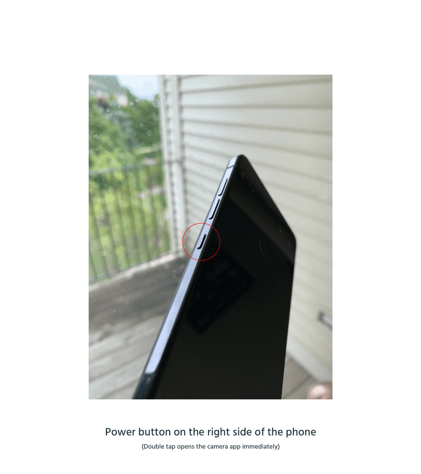
On the Essential smartphone, double pressing the physical power button on the side of the phone opens the camera app. (I think this feature might be common across Android smartphones)
Double Press Power Button to Open Camera on Essential Phone
Trigger
The trigger is invisible in this case and is hidden behind another important action. The power button is one of the most used physical buttons on the phone and overriding it with another action makes sense. The choice of putting a quick camera open indicates the importance of smartphone cameras in our daily lives.
Since it is Android, you can pick a default camera app to open if you have more than one camera apps installed. It is a power user feature and can be found inside Settings and can be enabled by the user. A quick double press enables you to capture the moment quickly instead of having to unlock the phone and opening the camera app to snap a photo. The volume key right next the lock button makes for a nice physical trigger button.
Rules
This action is universal — works when your phone is locked or unlocked; if you are on the home screen or within an app. It is very simple — if you double press the power button, the camera app opens.
Feedback
When the double press is registered, there is a nice haptic feedback when the camera app opens.
The haptic feedback allows you to proceed with taking a photo instead of worrying if your action did actually register (and if the camera app opened or not).
Loops & Modes
If the phone is unlocked, after you have snapped the photo, you can access the photo library. But when the phone is locked, you can access only the photos that you have taken since you opened the camera.
By separating access depending on whether the phone is locked or unlocked, the feature lets anyone take a quick photo without the hassle of having to unlock a phone.
Microinteraction #3 — Headspace App Meditation auto-download
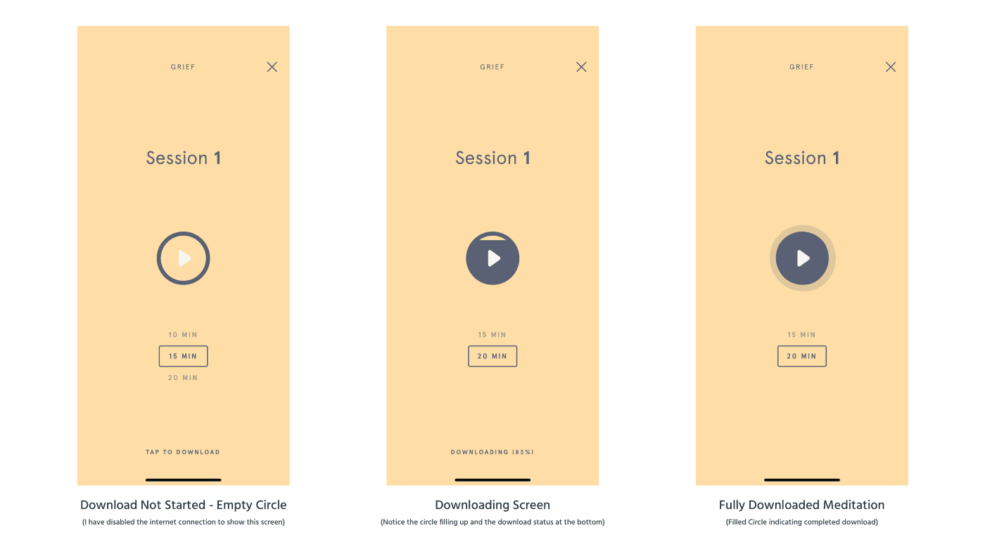
In the Headspace App, when you are on the meditation screen and if that meditation has not been already downloaded, it starts to download automatically.
Headspace App Meditation auto-download
Trigger
When you are in the meditation screen with a play button, auto-download is triggered. It is system triggered and there is no user control (you cannot turn it off in the settings as well).
If for some reason (in my case, I switched off the internet connection) your download doesn’t start, you get an option at the bottom of the page to start the download again. It will automatically download when it detects a valid internet connection.
Rules
A particular episode is downloaded only if it has not been already downloaded.
Feedback
Initially, the “Play” button is housed inside an empty circle. As the episode downloads, the circle fills up from the bottom indicating download progress.
This is my favourite part of the microinteraction. I find the simple but informational animation very appealing.
Loops & Modes
There are multiple time options on the same meditation page (3 mins, 5 mins, etc.) and each one is downloaded separately. When you visit the particular meditation’s screen second time, the circle is already filled indicating that it is downloaded and ready to be played.
Microinteraction #4 — “On This Day” Banner in Day One App
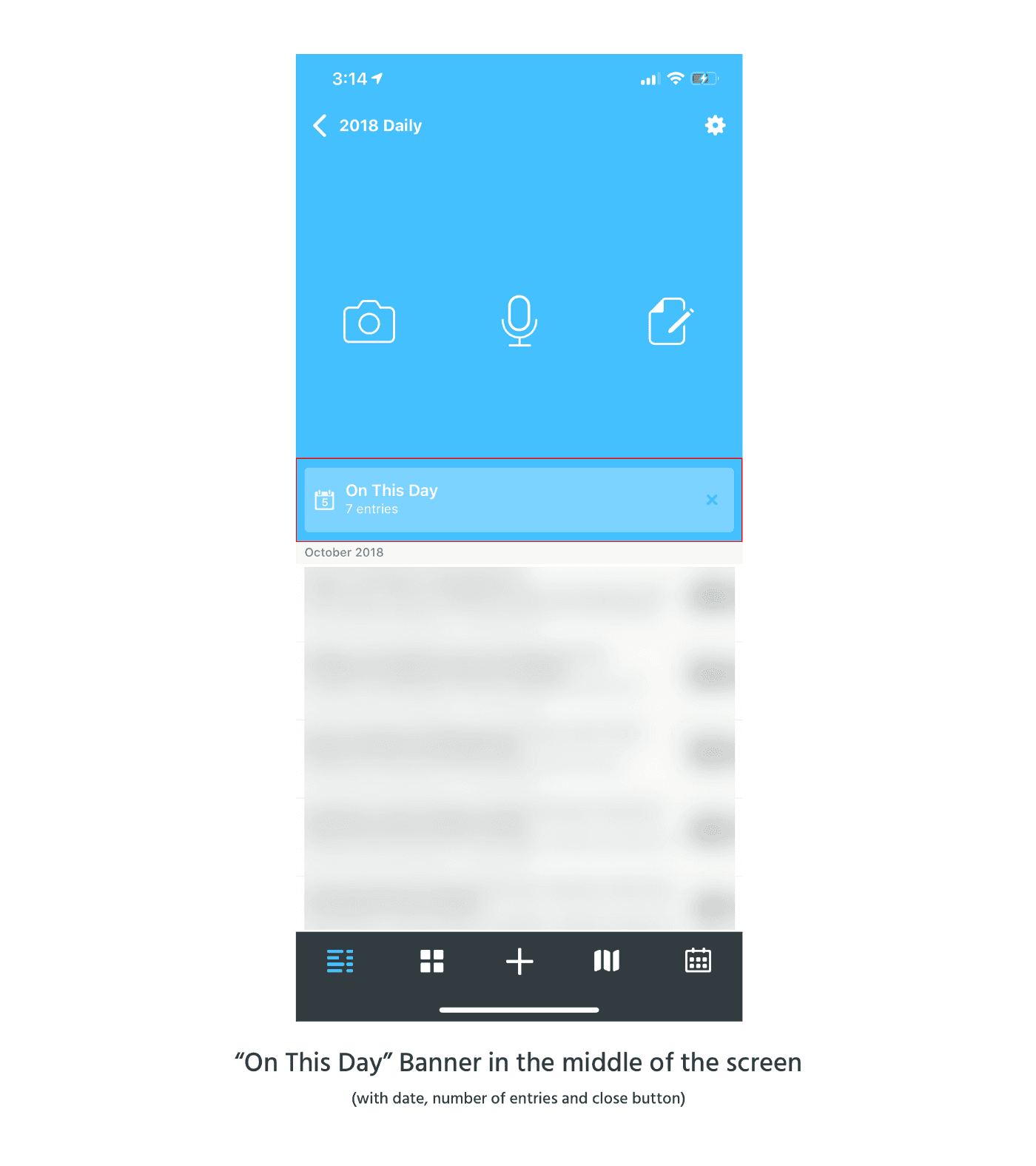
Day One, a journaling app, has this great feature called “On This Day” in its apps across platforms. You get notified about the journal entries on this day from the previous years.
“On This Day” Banner in Day One App
Trigger
System triggered. There are multiple triggers. If you have notifications enabled for the app, you get a notification that reads “On This Day, you have x entries”. Inside the app, it shows up in the middle of the screen above below the new journal types and above the list of entries as a banner.
You can choose to turn off the reminder and you can also close the prompt inside the app.
Rules
The system pulls entries from all your journals on this day across years and displays all of them in one view (includes entries for current day as well).
Rules are pretty clear — all entries with the same date are pulled and shown in one place.
Feedback
Clicking on the notification or the prompt inside the app takes the user to the same place — a scrollable list of all entries on that day from over the years in reverse chronological order.
Loops & Modes
This is a long term feature and appears only after you have been using the app for a year or you have manually added entries for previous dates.
Microinteraction #5 — Stand Reminder Notification on Apple Watch
On the Apple Watch, you get a stand reminder if you have been sitting for a period of time.
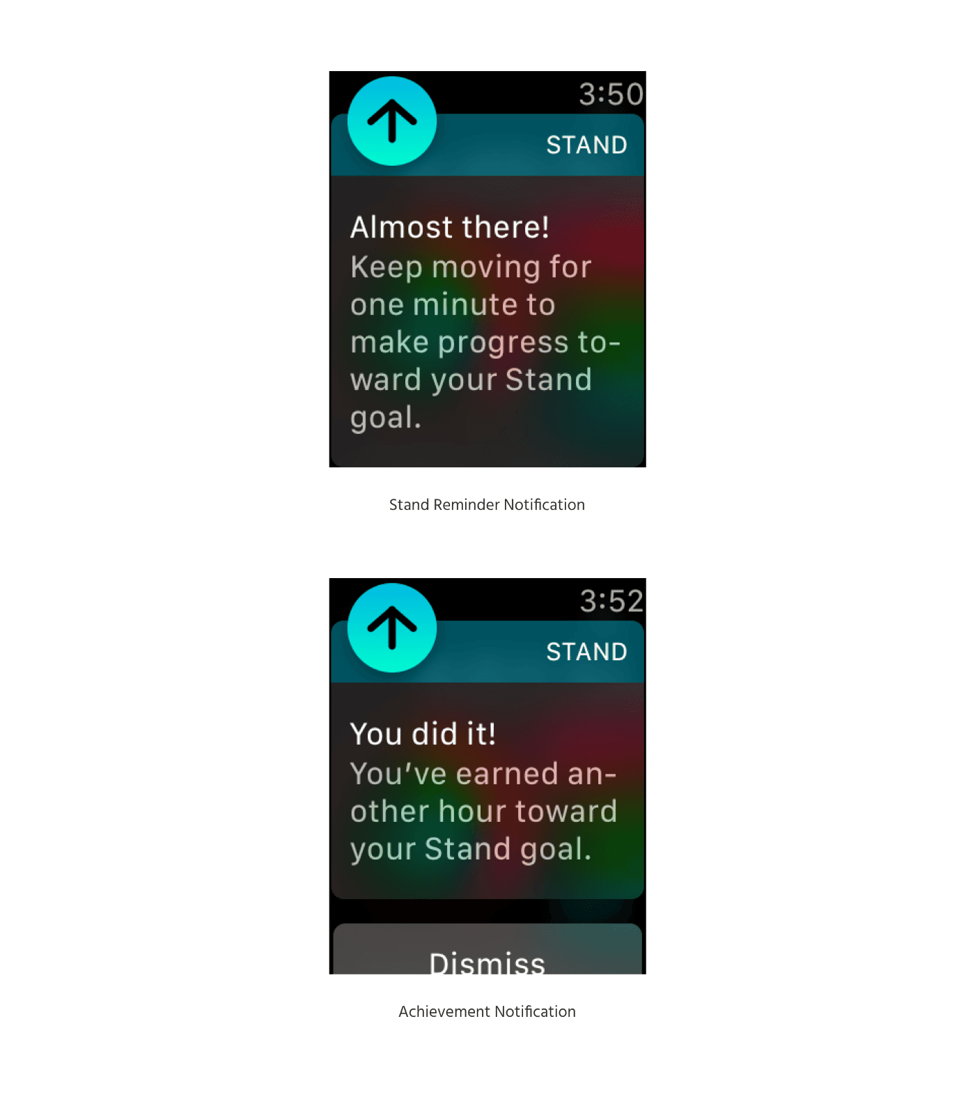
Stand Reminder Notification on Apple Watch
Trigger
The trigger is a notification on your Apple Watch with the title “Stand”. In the content, it tells you to stand up and move a little for a minute. The trigger is system triggered based on the rules described below. You can disable stand reminders in the Apple Watch app.
Rules
When you haven’t been standing (& moving) for a minute in the first 50 mins of the hour and you haven’t completed the stand goal for the day (12 stand hours), you get a Stand reminder. Once you complete the standing up and moving part, you get an achievement reminder as well.
Feedback
If you have haptic feedback enabled on the Watch, a nice tactile haptic feedback accompanies the notification. Once you have been moving for a minute, you get another notification that tells you that you have earned an hour towards your Stand goal. When you don’t stand up and go on with your work, there is no achievement notification or any other feedback.
Loops and Modes
Reminds you every hour until the goal stand of 12 hours in a day is achieved.
This feature has been instrumental in getting me out of my chair every hour. Occasionally, it wakes me up during the night’s sleep as well — which is something I don’t want. It would be great if I get stand reminders only after I have waken up.
Microinteraction #6 — Directions Button in Google Maps
I use Google Maps almost every single day. When you click on a location in the map (or search for a location), you get a card with the description of the place and two action buttons — “Start” and “Directions”.
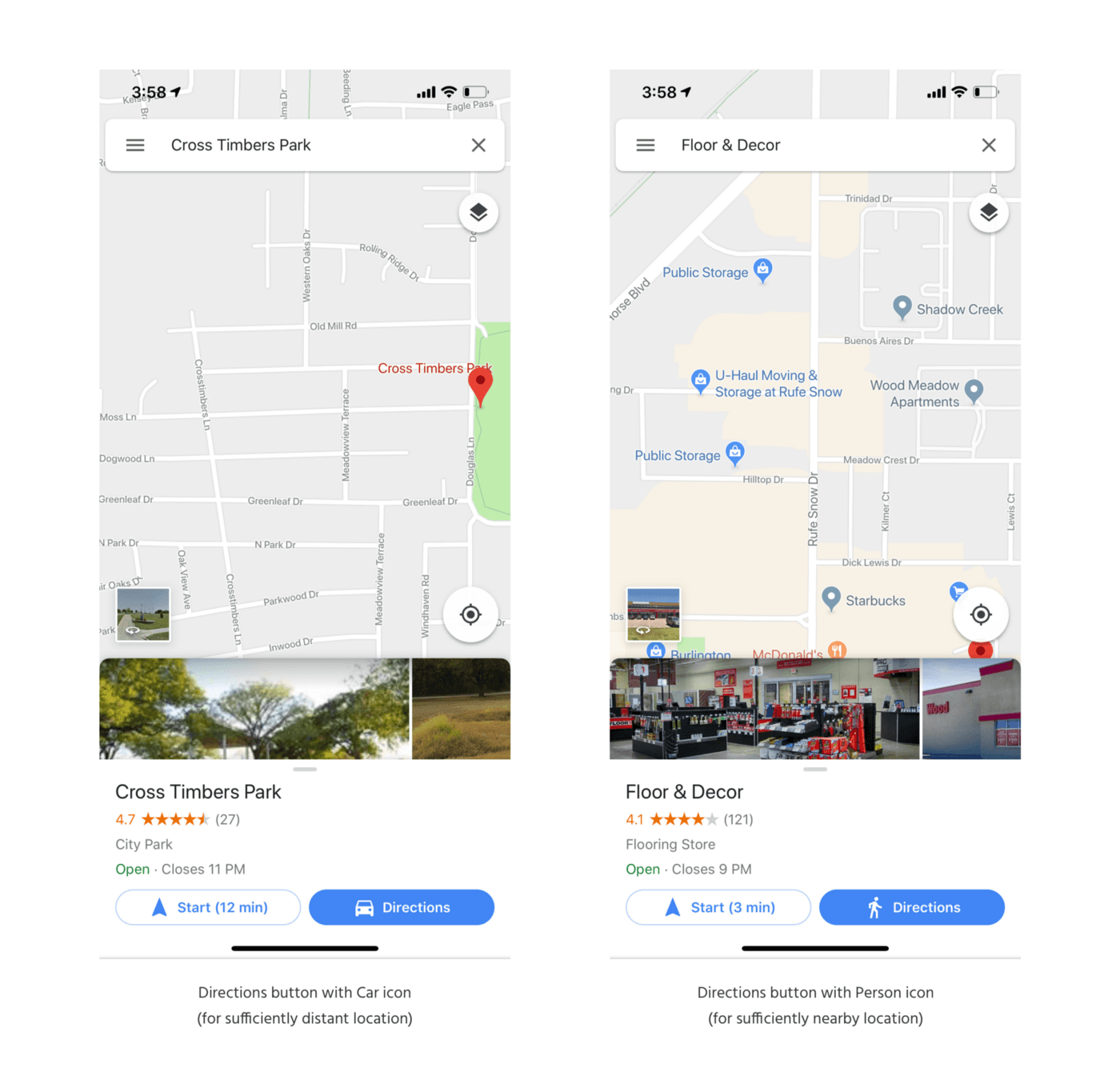
Directions Button in Google Maps
Trigger
I am sure the designers at Google had their reasons for why “Start” is the secondary action button (outlined) while the “Directions” is the primary action button (filled). The trigger for “Directions” is a button that easily catches your attention with a blue background and white text. It is also more easily accessible to the people who use phones in their right hands (closer to the thumb).
The Directions button also has an icon before the text “Directions”.
Rules
When the “Directions” button is clicked, it takes the user to a directions page with current location and destination filled with relevant information. There are multiple modes to choose from.
Feedback
Visual feedback. When you click the Directions button, you get to the directions screen with an overview of the route.
Loops and Modes
The default directions mode is calculated based on the distance between the source and the destination. If the destination is very close, then the “Directions” button has a “person walking” icon and it opens the directions screen with walking selected by default. If the destination is far, then the “Directions” button has a “car” icon and the default mode in the directions screen is car.
By showing you the icon in the “Directions” button, they are giving you a small preview of the type of information you will see on the next page (the transmit mode). Dan Saffer explains this concept as “Bring The Data” forward in his book — Microinteractions.
Microinteraction #7 — Google Photos Sync Status Information
In the Google Photos app, you get a “Cloud” icon on the top-right corner of the app. I did not really think much about it until my phone was stolen and I lost more than 500 photos.
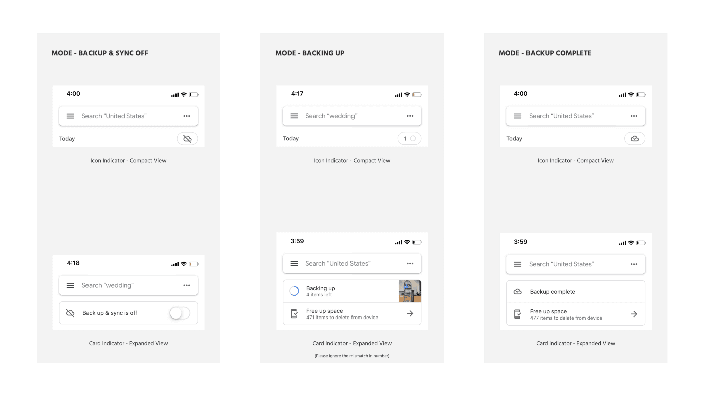
Google Photos Sync Status Information
Trigger
On the top right area, an icon (“cloud with a slash”, “cloud with a tick inside it”, “progress indicating circle”) is displayed depending on the current sync status. Its location is optimal— neither in the middle of the screen nor completely away from your attention. Like all icons in Google products these days, it is an outlined icon .
Rules
Tapping on the icon reveals the a card like interface with options corresponding to the sync status. These option cards can also be revealed when you swipe down and scroll up from the top of your photos. When you swipe up and scroll down, the two options animate into an icon
Feedback
Visual feedback. When you tap the icon, it expands into two options.
Loops and Modes
- Backup & Sync off — Icon is a “cloud with a slash”. The options card contains only 1 option and that is a toggle to enable Backup & Sync.
- Backing Up — Icon is a progress indicator circle with a number preceding it (the number indicates the number of items left to be backed up). The card options also reveals similar information & has a Freeup space option that asks you to delete photos from the device.
- Backed Up & In Sync — Icon is a cloud with a tick inside. The options card reveals “Backup complete” text & the Freeup space option.
I really wish they gave the user an option to hide the “Freeup Space” option since our phones are sufficiently big these days.
This is one of my favourite microinteractions so far. The rules are clear, the feedback is great and brilliant use of the concept of “Bring the data forward” -showing the items left when backing up is such a delightful touch. A lot of thought has been poured into designing the sync status and all of it is hidden inside a single icon. Brilliant.
Microinteraction #8 — Add image to tweet on TweetBot 2 on Mac
On TweetBot 2 in Mac, to add an image to a tweet, you have to click the settings icon, select Add Image from the dropdown option before getting the image picker.
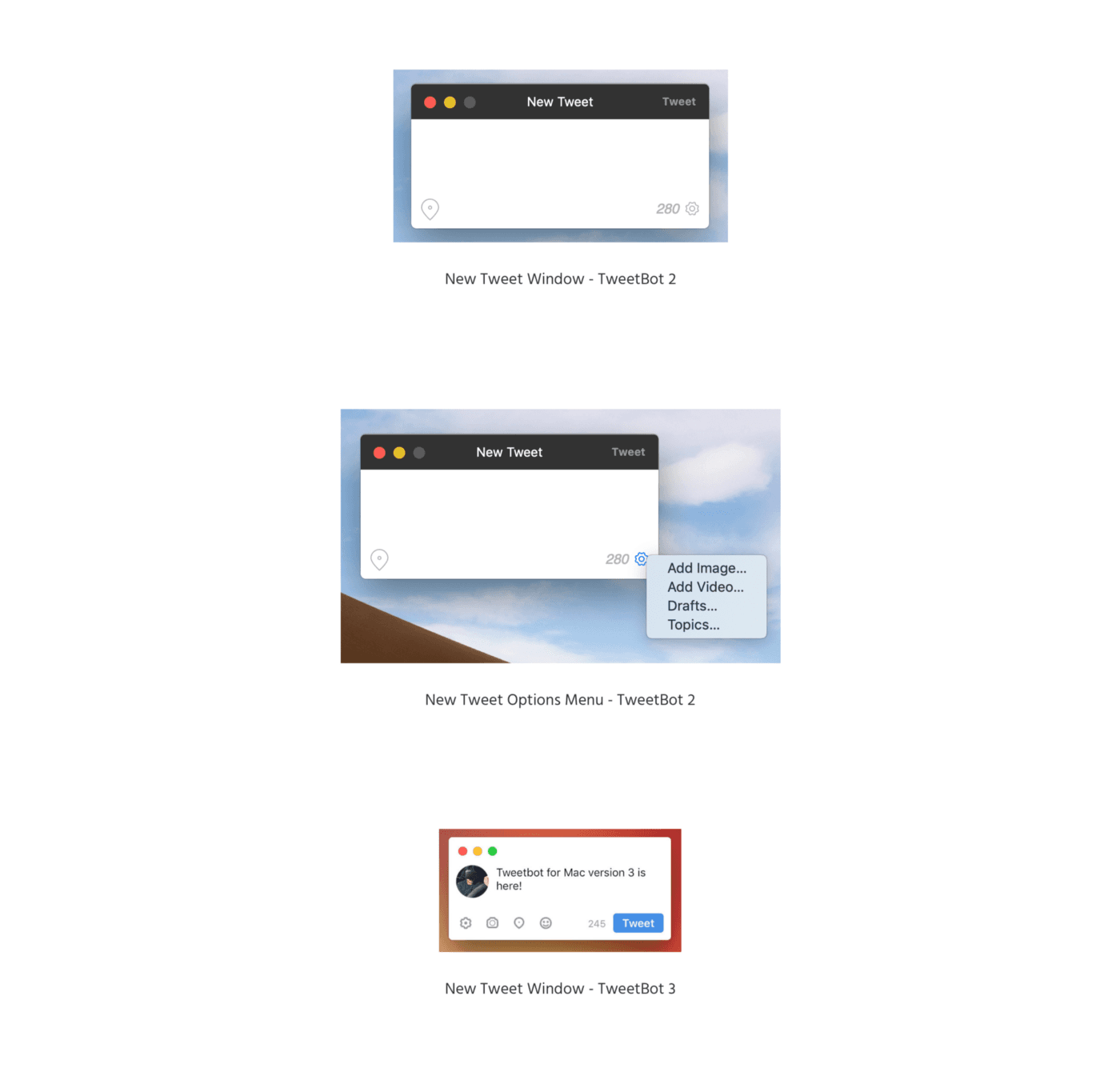
Add image to tweet on TweetBot 2 & TweetBot 3 on Mac
Trigger
The trigger is a settings icon that reveals a menu to add different media types to the tweet. The trigger’s icon isn’t obvious and requires a needless extra step. There is enough space in the New Tweet window to include those menu options directly on the New Tweet screen as icons.
Rules
Selecting the image option from the menu reveals Mac OS’ default file picker.
Feedback
Once added, a thumbnail of the image shows up on the tweet composer on the right side.
Loops and Modes
As you add more images, it shows up on the right side of the current image. It fills up a small 2x2 grid of four images — which is the maximum you can add in a tweet (there is no feedback for that unless you click on the settings gear to see the “Add Image” option greyed out).
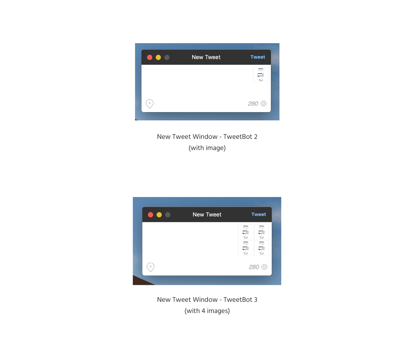
New Tweet window with Images Added
This is an important interaction and not a lot of attention has been paid to it. TweetBot 2 is a great app and I use it daily but I just wish these things would be taken care of.
They have fixed this in TweetBot 3 which is a paid upgrade.